Feeds:
Posts
Comments

The Rude Giant at Cerne Abbas

I’ve often heard it said that Europe is a bit surreal for Americans because it has been heavily settled for a very long time, and so many things there are much older than recorded history in North America.  I recently ran across an interesting example of exactly that.  Cerne Abbas is a small village in Dorset, England with a population of less than 1,000.  It’s known as a tourist town for several reasons, but the biggest is found on a hill just north of town.
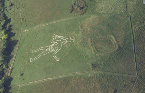
Giant1

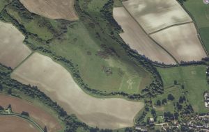
Photo straight from Google Maps (the Trendle ruins are visible above the giants head at the hill crest)

The Cerne Abbas giant is part of the National Trust which makes it an official historic landmark in the United Kingdom.  The giant is a 180 ft tall 167 ft wide outline carved into a hillside just outside Cerne Abbas.  The outline was created by digging a roughly 1 ft wide by 1 ft deep trench in the desired shape which was then filled with chalk.  The giant is carrying a club and blatantly male due to the highly visible erect penis roughly the same size as his head.  He is carrying a club in one hand and archaeologists have discovered evidence that a cape or something similar was draped over his outstretched arm but has been allowed to deteriorate until no longer visible.

Photo also from Google maps.  With buildings for scale.

Photo also from Google maps. With buildings for scale. (Click to biggen.)

No one is quite sure how long the giant has been on the hillside.  The style is reminiscent of Iron Age artwork, and there is ample evidence of Iron Age settlements in the area, but no written record of the giant can be found until 1751 leading many scholars to believe he was constructed in the late 1600’s.  National surveys in the area don’t make mention of the giant until around the same time frame and some historians think it may be a parody of Oliver Cromwell.  The presence of an abbey in Cerne Abbas also casts doubt on the possibility of the giant being created earlier because most consider it unlikely the monks of the abbey would allow a pagan symbol so close to their home.
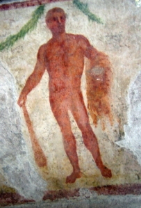
Fresco of Hercules with the skin of the Nemean lion from the Museo Archeologico di Milano (Archaeological Museum in Milan, Italy)

Fresco of Hercules with the skin of the Nemean lion from the Museo Archeologico di Milano (Archaeological Museum in Milan, Italy)

Competing theories posit that the giant was created during or before the Roman occupation of Britain due to its resemblance to Hercules.  These theories are partially based on the presence of ancient ruins known as The Trendle on the hill above the giant  These theories gained enormous weight after the discovery of the obliterated line indicating something draped over his arm as that creates a parallel to Hercules with the skin of the Nemean lion draped over his arm.

Local legend says that the giant is the outline of an actual giant who traveled to Britain from Denmark and was slain on the hill.  It’s also considered a fertility symbol, and sleeping between the giants legs would grant you a child.  This theory was given a little extra weight in 2010 when it was reported that women in the area around the giant have a much higher fertility rate.  Apparently it seems likely enough to give it an effort because the local constables receive a lot of calls about couples in the grass around the giant.

It doesn’t surprise me in the least that the giant has bee used to sell everything from condoms to jeans, and in 2007 he was used as part of a publicity stunt for the Simpsons movie when a giant Homer Simpson holding a doughnut was painted in the field next to the giant.  Homer was painted with biodegradable paint and local pagans who were very offended by his proximity to the giant were reported to conduct rain magic to wash Homer off as quickly as possible.HomerGiant
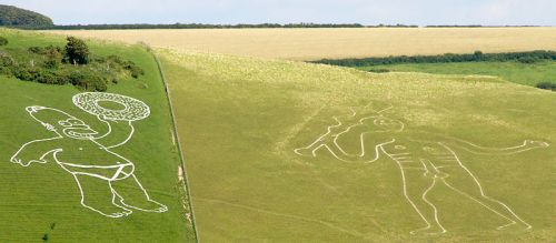
In the 1930’s the British Home Office received an outraged request from the Bishop of Salisbury to cover up the giants prominent phallus in some way but it came to nothing at the time.  The Bishop did partially get his request during World War II when the giant was covered up so that Nazi bombers flying across the channel could not use him as a landmark to find their way to targets.

Prevailing academic theory seems to be that the giant was built in the 1600’s, but I prefer to think he’s a lot older than that.  I much prefer the theory that he is Hercules and was created during the Roman era in Britain.  Creating the giant would be a huge amount of effort before the invention of construction equipment which makes him seem more of religious significance than some sort of political parody.  The giant also seems to be very high maintenance (the National Trust used a flock of sheep to keep the grass trimmed for years) so it wouldn’t be difficult for him to disappear for a few centuries until the time was right for him to return.
The Forbidden Hawaiian Island

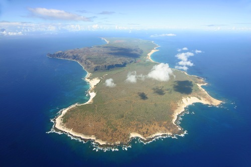
niihausatI’ll admit, I have a bit of a fascination with the TV show Hawaii-Five-0.  It’s a blandly satisfying mix of action scenes and nearly static characters, but explosions and guns aren’t why I’m fascinated with it.  No matter how much the episodes resemble each other week to week I can’t quit watching it because it’s just so different from Tennessee, and it has great beauty shots every time it comes back from commercial.  (I can’t quit watching Nashville for similar but opposite reasons.)  From time to time I learn something interesting just by virtue of its physical and cultural distance from me.  Last time it was about  the history of money, and this time it’s the Forbidden Isle.

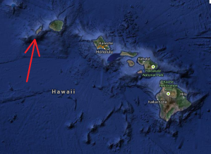
Hawaii is made of eight major islands and a lot of smaller specks of land not quite big enough to geographically justify being called an island.  The one I want to talk about is Ni’ihau, the Forbidden Isle.  For perspective the largest Hawaiian island, and the one the state is named for, is 4,028 square miles and has a permanent population of 185,079.  The smallest island (not including the bits and specks of land too small to be called an island) of Kaho’olawe is 44.6 square miles and has no permanent population.  Ni’ihau ranks seventh of the eight major islands in size and population with an area of 69.5 square miles and a population of 170 (2010 census).

Now that the facts and figures are out of the way, let’s get to the interesting part.  Ni’ihau’s nickname, and the reason for it, are what caught my attention.  Turns out that Ni’ihau is called the Forbidden Isle because it’s private property owned entirely by the Robinson family.  Showing up without an invitation is trespassing, and the Robinson family doesn’t appreciate uninvited visitors.  The island has been off limits to the general public since the 1930’s and even family members of island residents need special permission to visit.

In 1863 Elizabeth Sinclair left New Zealand with her extended family intending to buy a ranch in Vancouver.  When Canada didn’t prove to her liking the family moved on to Hawaii, then often referred to as the Sandwich Islands.  The family decided against buying various tracts of land in what is now downtown Honolulu, Waikiki Beach, and Pearl Harbor at which point King Kamehameha IV made them an offer they couldn’t refuse.  Kamehameha offered them the island of Ni’ihau which was home to approximately 600 native Hawaiians.  After the dust settled the family had traded 68 pounds of gold (then $10,000 and roughly $1.4 million at the time of this writing) for the 69.5 square mile island.  (Try here for a snapshot of what the island was like when the Sinclairs bought it.)

Before the family took possession the island was considered property of the Kingdom of Hawaii and after the sale the native residents were allowed to stay.  Turns out that this wasn’t one of those incidents where the white man got one over on the natives.  Kamehameha saw the Sinclair family coming and took advantage of the opportunity to make some easy money on some land not worth much.  At the time the Sinclair purchased the island it was lush and green from two years of abnormally high rainfall, but it usually averages no more than 25 inches per year making it difficult to grow much on the island.  The residents had been trying for years to buy the island from the Kingdom but couldn’t raise the money due to the barren nature of the island.   However, as often happens with real estate, the family did end up with the better end of the deal just by holding onto the island for 150 years while the Hawaiian islands became a tourist mecca.

The purchase of the island may have turned out to be something of a good thing for the natives that lived on it.  Elizabeth Sinclair and her heirs turned out to have a healthy respect for native Hawaiian culture and history and have preserved a lot of Hawaiian heritage over the past 150 years as the rest of the islands were acquired by the United States and progressively modernized and became more homogenized with mainland US culture.  To this day Ni’ihau is undeveloped and is in a condition pretty close to what it looked like before European explorers discovered the islands in the 18th century seemingly thanks to the stewardship of Keith and Bruce Robinson, current owners and 5th generation heirs of Elizabeth Sinclair.   Keith Robinson is an environmentalist and is acclaimed for using the remote island to nurture varieties of plant life that are extinct on all the other islands of Hawaii.

Legally speaking, residents of the island are ‘guests’ and can be evicted at the discretion of the owners, but Robinson provides housing and some healthcare, such as vaccinations.  When the family operated a cattle ranch on the island most of the natives were employees and all were provided free meat.  There are conflicting reports, but it seems that these days most of the natives have to spend at least part of the year working on the neighboring island of Kauai because the Robinsons haven’t had a lot of success at making money on Ni’ihau.  Most food and supplies are brought over from Kauai and the primary monetary influx to the island is from the US Navy that rents part of the island for a radar station to monitor the Pacific Missile Range Facility .  The island has recently been opened up to a limited amount of tourism in the form of day tours on the island.  The other major source of income on the island is collection of the unique shells that wash up on the island’s beaches.  Leis and other native art made from Ni’ihau shells are highly sought collectibles in the art community.

The Robinsons have had to fight fiercely to maintain the island as their own property.  They’ve used income from their other holdings in Hawaii to subsidize life on Ni’ihau and pay taxes.  They’ve faced a fair amount of opposition from Hawaiian sovereignty  groups demanding the island be seized and turned over to the residents.  There have been demands that the state use eminent domain to turn the island into a state park, and an effort by the US Fish and Wildlife Service to declare large chunks of the island off limits due to the endangered plants.  They’ve reportedly also turned down very lucrative monetary offers from the US government as well as large commercial interests.  There’s even a 2005 documentary about the Robinsons and their fight to keep the island private.  So far the Robinsons have successfully resisted any attempts to open up the island and it will be interesting to see how the island fares as the next generation of Robinsons takes over.

Further reading:

Scene of the (almost) crime

Remember that discussion from yesterday about stormwater pollution and NPDES permits?  I have to admit, I’m a cynical soul and I’ve had my doubts that the public education requirements would make any real difference.  Tennesseans don’t like the government telling them what is good for them.  So I was actually pretty surprised at a bit of drive-by green heckling I witnessed the other day.

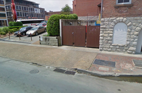
To entirely appreciate this story you have to know, First Avenue in Nashville is essentially the back alley for the tourist traps and bars on Second Avenue.  All the businesses have their dumpsters back there and a lot of random garbage ends up on First and the sidewalks are sometimes unpleasant.  (It’s a really odd choice since First fronts the river with the stadium on the other side and has the potential to be really nice, but that’s a story for another time.)  It’s also a large downhill grade that bottoms out at Broadway, the other tourist trap of downtown Nashville.  So all the garbage from both often ends up at First and Broadway.

I was idling at the traffic light at First and Broadway watching an employee of Hard Rock Café hosing down the sidewalk around their dumpster.  He had quite a pile of random garbage on the sidewalk and I was hoping he wouldn’t wash it into the drain since it would be floating in the Cumberland River a few minutes later (this is literally 100 ft from the river).  Right about that time a guy in a giant pick-up drives past me leaning nearly all the way out of the window and yells at the Hard Rock guy “Why don’t you pick it up instead of washing it out into the street!”.

I was torn between delight that he noticed and anger at the level of asshole required to yell at some poorly paid employee about something that small.  Even better, right after this happened the Hard Rock employee grabbed a dust pail and started scooping up the garbage.  I don’t know if the heckling had an effect or if that was his plan all along, but I was very happy to see both of them paying attention to such a minor detail.  I’m not going to claim my cynical heart grew three sizes that day, but apparently the education efforts are working.

Photo by Flickr user dogsbylori

Photo by Flickr user dogsbylori

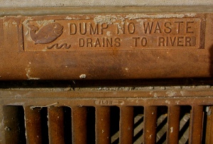
These days just about every city or town in Tennessee has to have a special permit related to stormwater.  Stormwater is runoff from a rainfall, and the part that goes into those ubiquitous road drains is of particular interest because those drains are direct lines to natural waterways. In heavy urban areas stormwater can be just as polluted as the water coming into a sewage treatment plant but it doesn’t get treated before ending up in the river.

Stormwater falls into an EPA permitting program called the National Pollutant Discharge Elimination System, generally known as NPDES.  NPDES covers A LOT of different pollution sources and you pretty much have to be a specialist to understand all the in’s and out’s of the program, but the important thing for the moment…  A few years back nearly every Tennessee city and town of any size was required to get a permit for their stormwater systems (some larger industrial sites and other entities had to get their own permits as well).  The permit requires the municipality to do its best to improve the quality of the storm runoff.  This involves things like litter programs, street sweeping, filters in curb drains, and endless other possibilities.  Cities that have programs for curbside pick-up for fall leaves or grass clippings may even get to count that since it keeps organic pollutants out of natural waterways.

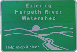
untitledMost municipal NPDES stormwater permits require a certain amount of money be spent on public education.  The idea being that if people know what types of behavior cause pollution they’ll quit doing it.  The earliest efforts involved obvious things like making sure people knew those road drains go to the river because their was a common belief that the road drains went to the sewage treatment plant.  These days towns are getting creative with the public education component.  Farragut (suburb of Knoxville) has one of the more creative outreach and education efforts that I’ve heard about in Tennessee.     One of their programs invites local artists to decorate rain barrels which are then sold to the community.   The watershed signs you’ve probably seen on interstates throughout Tennessee are part of TDOT’s NPDES mandated public education efforts rather than simple government waste as some people think.

It remains to be seen just how successful the public outreach and education programs are.  I’m a bit skeptical, but I did get a free rain gage with Memphis Stormwater Department’s logo on it…

Hugh Howey’s story ‘The Plagiarist’ has been around for awhile, but it felt pretty timely when I got around to reading it.  The gaming world has been saturated with stories about ‘Sim City’, an excellent (albeit flawed) game about planning and running a simulated city.  The Plagiarist is about a man, and an entire society, that loses itself in those same type of simulations.

Howey’s story takes places in the near future where games like Sim City have been combined with artificial intelligence to a degree that the characters in the simulation are essentially people in their own right.  Universities and corporations run server farms dedicated to these artificial worlds where the software citizens are as intelligent as we are and they’re allowed to develop in their own ways.  Thanks to the time dilation (time moves quicker in the sim than in reality) scientists are able to study aspects of their fields they can’t otherwise see.  Geologists use them to study planet formation.  Psychologists and anthropoligists use them to study relationships without the observer interefering.  The simulation is so good that the simulated people have started doing their own independent research and found interesting new inventions and cures that never came up in our world.  An entire profession has sprung up where practitioners go into the simulation and bring details from these simulated advancements for use in the real world.   The protaganist is a literature professor who has a side hobby of searching the simulations for the next William Shakespeare.   The story begins at a point where the simulated worlds have started their own simulated worlds.

The Plaigarist is a very plausible extrapolation of current trends in internet usage, social media, and computing will probably take us in the near future.  It raises some very interesting questions about identity, and reality versus virtual spaces.  It’s also a great sneak peak at the ethical issues we’ll be confronting as software gets more lifelike and potentially learns to think for itself.  It’s available as an e-book .

Tor publishing has an interesting expirement going on right now.   Tor has been publishing John Scalzi’s The Human Division weekly since mid January as an experiment in episodic fiction.  On the eve of finishing the volume (the last episode is out tomorrow), the experiment seems to be a success .  I’m not going to spend a lot of time reviewing the story itself, suffice to say it’s really good and woe be unto anyone who expects me to get work done on Tuesday mornings before I’ve finished the new installment.  I do want to spend a few words on how the weekly publication has played out for me.

 From the outset weekly publishing had one very obvious benefit for me, though I suspect I’m in the minority about this one.  The trademark Scalzi wit is snarky and irreverent with a liberal dosing of goofy.  This is, after all, the same man who wrote a story about yogurt taking over the world.  I do enjoy his work (and I’m in awe of the universe he has set up) but I’m not the biggest fan of humor in my sci-fi and too much joking gets grating after a while.  So while a week seems like a long time to wait for the next plot point, it ended up being just right for keeping me from getting tired of snark.  (This is a minority opinion on my part based on the success of Scalzi’s last novel, Redshirts.  Not to mention the complete works of Douglas Adams…)

When the episodes were announced I expected a regular novel chopped into bite size pieces, possibly with an extra cliff-hanger or two to keep readers ‘tuning in next week’.  What I got was worlds better than that.  The story is specifically designed to be presented as pieces.  Tor and Scalzi have likened it to a season of television with a semi-self-contained plot each week bound together by an over-arching story to keep readers coming back.  Even that analogy is a bit lacking because several of the episodes take place on the fringe of the main plot and don’t include the primary characters at all.  I’ve found it best described as complimentary short stories.  The jumping around was surprising but it came together well over the course of the overall story.

I do find myself wondering if the story is going to suffer from a lack of integration now that it’s going to be available as a whole.  Tor is publishing a hard back of the entire thing in novel form and I’m interested to see how those who read it all at once feel about it.  It hangs together much better as a series of stories and seems like it would be very choppy and jarring to jump around a full novel this way.  Quite a few interesting characters are presented and discarded in various weekly installations and I suspect that would be really frustrating to a reader going through it all at once.

The last benefit I want to point out is fiscal.  As the dad of twins who need TWO OF EVERYTHING I found a small dollar amount every week a lot more palatable than the $25 purchase price of a full flown novel.  All I had to do was skip a trip to the vending machine every Tuesday and I got a fun read in return.

I highly recommend The Human Division.  Anyone can enjoy it, but you’ll get a lot more out of it if you’ve read at least a little of Scalzi’s previous work in this universe (Old Man’s World, The Ghost Brigades).  I also recommend you read it with a time gap between installments.  If not a week, then at least a day or two.  If you’re on the fence, this story over at Tor introduces the major characters of The Human Division and is a good indicator of the writing style.

 I’m curious to hear what Tor and Scalzi have to say about the results of their episodic experiment, but from a reader’s point of view I’d declare it a success.  I’m not interested in giving up long form novels, but this is a great compliment to that form of reading and I hope Tor continues trying it in this form of complimentary episodes that Scalzi has pioneered for them.

 This is not strictly related to above, but I want to give a shout-out to Tor for the free short fiction on their web site.  They’re great about publishing new stories from some of my favorite authors and exposing me to new ones via stories and excerpts.

The free body diagram

The free body diagram is a simple concept that most engineering students learn in their first year of college.  It’s a teaching tool, and the first step toward learning to analyze forces in a high rise building.  I’m going to get a little out of my water/drainage design wheelhouse here and go into an analytical tool used more for structural engineering.

Have I made it sound interesting enough that you’re willing to sit through this next part?  Because it really is an elegant concept.  I’m going to do my best to explain without getting deep enough to put anyone to sleep.  If you get bored, skip to the last two paragraphs. (Feel free to laugh at my MS Paint sourced drawings as well.  It was either that or hand drawn.)

A free body diagram is a conceptual drawing of a physical body with all the forces that are acting on it.  It’s isolated from anything in its environment that doesn’t cause a physical force on it.  The object is at equilibrium (either standing still or moving at a constant velocity).  It’s most widely used as a conceptual tool to teach students how to analyze forces, and generally you use known values to solve for unknown.

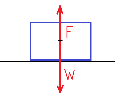
The classic teaching example is a block on a surface.

fbd1a
This version is simplistic enough to be of pretty much no use, but it does illustrate an important idea that most everyone instinctively knows but no one actually thinks about.  Gravity pulls your weight down (shown as W in the diagram) while the bulk of the earth holds you up by pushing back (shown as F1 on the diagram).  Since the block isn’t moving, F = W.

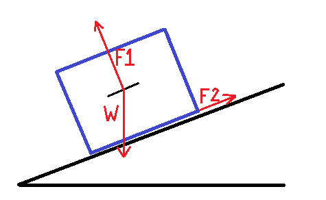
fbd2It starts to get more interesting when you incline the surface.  The block is still stationary, but it does introduce another force.  You still have W (weight of the object) and F1 (force holding it up), but now you also have a friction force (F2) keeping the block from sliding down the slope.  Friction is caused by two surfaces pushing against each other and it’s felt at the point where the block touches the surface.

This diagram is overly simplified, but still marginally useful as an example because it illustrates a couple of potential real world questions. (1) How much force do you need to apply to move the block up the incline (A) and (2) how much can you incline the surface before the object slides down it.

Solving either of those requires one last concept.  I’m going to quit for the day (or more likely quit for the week considering my posting frequency) once I get this one done, so stay with me just a little longer.

Notice the weight of the object is applied straight down, but the counteracting force is applied perpendicular to the surface.  Conceptually this means that only a portion of the entire weight of the block is trying to make it slide down the surface.  On a more practical level, we can’t solve the problem while the forces are going in so many directions.  The solution involves breaking the force down into its component vectors. *

* This concept of component vectors is the most basic to any engineering analysis, and it’s why the free body diagram is such a useful teaching tool.

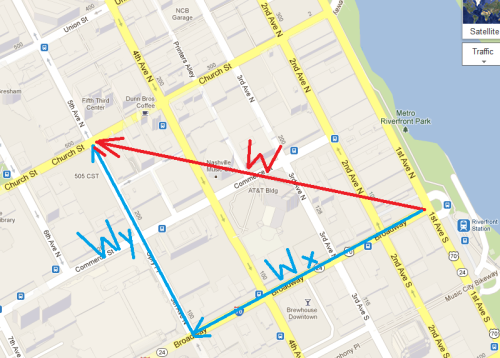
Component vectors are essentially straight lines used to describe a diagonal.  The best example I’ve been able to come up with is directions on a city grid.  Let’s say we want to go from 1st and Broadway to 5th and Church.  As the crow flies that’s fairly straight forward.  But if you’re trying to tell your friend Maggie (who can’t fly) how to get there, you would tell her to go four blocks on Broadway, turn right, and go two blocks on 5th.

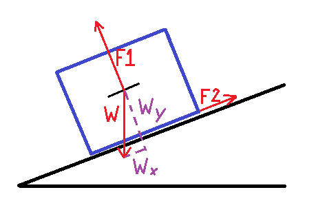
mapSo, back to our free body diagram.  W is ‘as the crow flies’ so we have to break it down into ‘four blocks on Broadway (Wx component) and four blocks on Church (Wy component)’.   I’m not going to get into how the sausage is made, suffice to say it involves principles of the geometry of right triangles that’s taught around the high school sophmore level.  I just want everyone to understand it has to be done.  Below is our revised free body diagram with all the forces on our grid system.

fbd3aThe take away here is this:

The weight acts in two directions.  It pushes back against the surface (Wy) and it wants to slide down the surface (Wx).  As you steepen the slope Wx goes up and Wy goes down.  (That’s pretty instinctive.  The steeper the slope, the more likely something is going to slide down it.)  Friction (F2) keeps the block from sliding down the slope meaning Wx is less than F2.  As you steepen the slope Wx gets larger while friction levels off.  When you get to where Wx is larger than friction, the block moves.

Now you have the same training as a freshman engineering student a month into her first Physics class.  From here on they start adding complications like springs, pulleys, diagonal forces, variable friction, and so on with the eventual goal of being able to analyze things like the forces at work in a high rise building frame.

Maps, toilets, and disillusionment

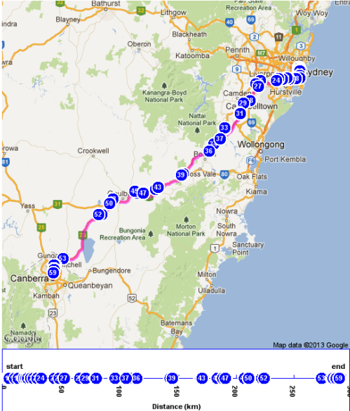
By virtue of a serendipitous Google accident, I ran across an awesome map.  Turns out our friends in Australia have an impressive map of all public access toilets in the country.  You can map all the toilets near you or you can give it your trip start and end points and it will show all the toilets with travel time between them.  It even comes as a mobile app.

ausmapTurns out this map is part of the National Continence Management Strategy which the government of Australia has spent over $50 million on in the last decade and has goals in public education, research, and things like the National Public Toilet Map.  The website includes lots of fact sheets for the public and health care professionals and there is even a hotline and a monthly stipend for some people with continence problems.

At first I was impressed that the Australian government was willing to pitch in for people with such an embarassing and little talked about problem.  The more I thought about it though, the more angry I got.  I really shouldn’t be impressed that a national governement is making life better for its citizens, I should expect it.  I can just imagine the inane comments from the legislature if somebody wanted to do that here in Tennessee.  (Government Out Of Bathrooms)  Pundits would have a field day and the Tea Party would rake in contributions from conservatives who didn’t want the governement helping “people take a leak”.  

This sort of thing does eat away at my sense of exceptionalism as indoctrinated into most Americans at an early age.

Movie review: Skyfall

James Bond went old school for his fiftieth anniversary.  Or possibly oooooold school.  I don’t mean that Skyfall included throwbacks and homages to past Bond movies (but it did), I mean it threw out nearly all the conventions and tropes that the Bond was built on.  Most notably, all the complex gadgets the franchise is famous for are completely non-existent in this iteration.  Bond doesn’t meet Q in the lab with all the goofy/deadly tests going on, and Q sends him away with nothing but a Walther and a radio transmitter.  Not even a GPS device, an actual radio transmitter, and a large one at that.  The only concession to Q Division’s high tech history is the Walther makes sure no one can fire it but Bond himself.

So when I say old school… Bond faces the bad guys with nothing but his wits, a couple of trusty firearms, and the shiny Aston Martin from his early escapades in Dr. No and Goldfinger.  It’s an interesting choice, especially in a movie that goes out of its way to contrast intelligence work in the digital age with the old-school Cold War era work previous Bonds have done.  The movie works hard to make this comparison much to its detriment.  In the beginning I was expecting a ‘passing of the guard’ type where everyone acknowledges the importance of digital intelligence gathering while also needing field agents, but in end the message was that old-school brute force wins out over any digital finesse.  I won’t quibble with the message, but getting there seemed a bit misleading.

Skyfall continues the darker, grittier Bond that has been around since Craig took over the character in Casino Royale.  This is one change I heartily endorse.  The entire franchise was just a bit too in love with itself and had veered way too much in the direction of camp so a little more dark realism brings it back down to earth.  I did find myself a bit confused about one aspect.  Casino Royale was presented as a prequel of sorts.  A look back at the early days of Bond, but now just a few years later we’re shown a Bond on the decline.  A Bond who’s lost a step due to all the injuries and trauma he has been through and who needs a little ‘administrative’ help to pass his field fitness test.  It’s a creative choice in keeping with the old vs new conflict the film wants to keep beating us with and a logical point to reach in Bond’s career, but it was a bit jarring for people keeping up with the franchise.  I assume this is a meta effort to acknowledge and derail the familiar tropes of the franchise but it’s a bit of a character swerve.

They worked hard at humanizing Bond in a way that has never been done before.  Bond isn’t always at his best as the character was in the Connery days.  He spends a decent amount of run time looking hungover and scruffy.  This Bond doesn’t spend nearly as much time pitching woo as is typical and settles for a bit of perfunctory flirting with a fellow agent and a really rapey shower scene.  The main lady in Bond’s life is M, his boss and a blatant mother figure.  She is presented as a very morally ambiguous figure who made a lot of shady decisions but is ultimately on the side of the angels.  This character is even more humanized than Bond and has a much larger role to play than M has in any Bond movie I can recall.  The ultimate humanization of both characters occurs near the climax at the ancestral Bond estate in Scotland.

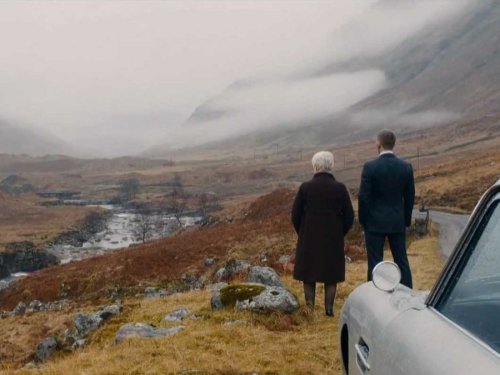
As always in a Bond movie, Skyfall has some really amazing locations.  The London scenes aren’t especially impressive, but there are some amazing shots of the harbor and skyscrapers of Shanghai as well as some extended scenes on a deserted island that seems straight out of a horror video game.  That said, my favorite by far is the location of the film’s climax.  The Scottish highlands are deserted and forlorn yet achingly beautiful and make brilliant use of fog, especially when the fog is backlit by exploding helicopters and a burning building.

Edit: I’ve since found out that a lot of these locations were actually filmed in studio due to MGM’s cash flow problems of the last few years with only establishing shots from the locations.  I’m a little dissappointed, but bravo for the staging.

I enjoyed Skyfall a great deal.  It’s never going to be mistaken for an Oscar contender and it’s a bit muddled and contradictory in places, but it corrects a lot of the excesses of the Bond franchise and goes a long way to present our hero as a real human instead of a sexed up human gadget deployment system.  I recommend it for any fan of action movies though long time Bond fans may be in for a bit of a shock.

Contour maps and drainage area

Today I want to talk about an amazingly useful tool that I’ve used to great effect many times.  Contour maps.  A contour map is a way of visually representing a three dimensional environment on a two dimensional plane (a sheet of paper).  In short, it shows the hills and valleys of the land area on the map.

The basic idea of contour mapping is that the lines are a constant elevation.  So if you were to walk the line depicted on the map you would never go uphill or down.  Each line represents a particular elevation, and the closer the lines are to each other, the steeper the grade.  A circle, or any closed shape, represents a hilltop or sinkhole.  When reading a contour map it’s always important to keep in mind, any sort of V shape means a ditch or channel, and it flows in the direction opposite of the way the V is pointed.

That description probably doesn’t make a whole lot of sense when written long form, but hopefully it will become more clear when you look at the map below.  If you take nothing else from this post always remember, more lines mean more hills and less lines means flatter.

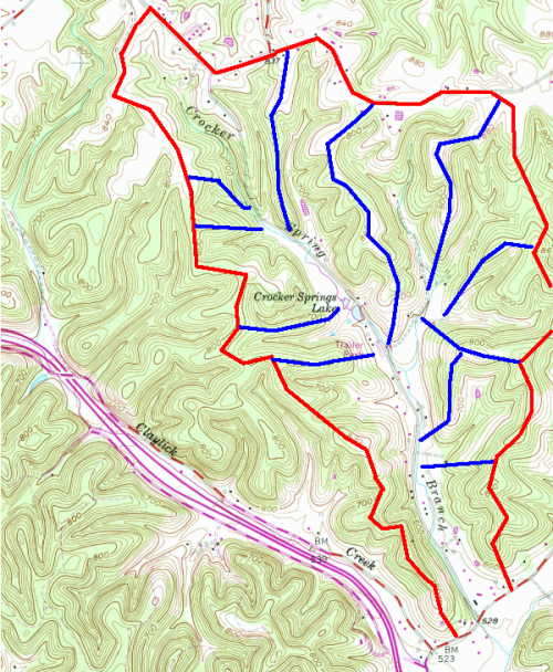
The thin brown lines are contour lines. Thick red and blue lines are added for effect.

Contour maps are used for a lot of things.  In hydrology they’re used for determining watershed boundaries and stream steepness.  They’re indispensable to land developers, and anyone interested in building anything other than a small house, because they help determine the suitability of a plot of land for various uses.  For example, the example map above has a lot of contour lines very close together indicating it’s very hilly.  It’s obviously too steep to farm, and you wouldn’t want to try and put up any large buildings.  A Walmart with a large flat parking area would be out of the question.

The primary use I want to discuss today is watershed delineation for bridge design.  The watershed area is a primary component in determining how much water is flowing to a particular bridge.  The sample map I’ve posted above shows the watershed of Crocker Spring Branch, which is a minor tributary to White’s Creek in northern Davidson County.  I picked this area because it’s local to Nashville and it has lots of hilly topography, making it easier to see for people who aren’t familiar with reading a contour map.

The example is delineating a watershed for the bridge at the bottom right corner of the map.  The overall watershed is in red with smaller interior watersheds drawn in blue.  The general rule is that water flows perpendicular to the contour line.  Determining watershed boundaries is a simple exercise in following the highest ridge.  You start at the bridge location and move out following the highest points.  I started to the left of the structure at the obvious ridge and followed it back from the road.  It tends to get a bit tricky when there are lots of smaller creeks flowing into the mainline, and I drew in several of those for illustrative purposes.  It’s a fairly simple process in a location with easily defined ridges like this, but it can be a bit difficult in flatter areas such as west Tennessee near the Mississippi River.

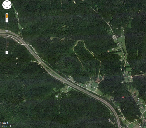
Here’s an overhead photo of the same area.  It’s very difficult to see much without the contour lines.

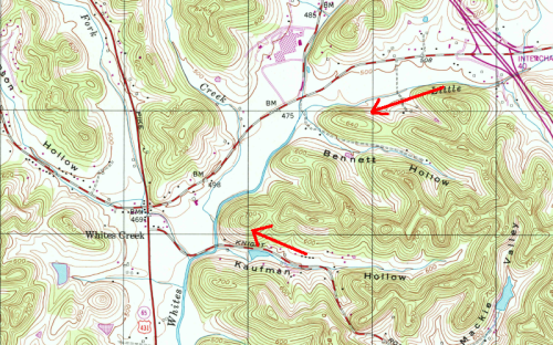
I’m going to close with this map clipped from the same general area as Crocker Springs Branch.  (I’ve placed red arrows beside a couple of the hills just to show how the contours close on each other.)  You can see Whites Creek running through the center, with several offshoot tributaries.  The general lack of contour lines around the main creek indicates a fairly wide floodplain and the general steepness of the tributaries indicates runoff is going to get to the main creek pretty quickly.  So based on this map you can conclude that Whites Creek probably floods regularly and it can rise fairly quickly.  You can also see how the roads are generally down in the flatter areas wedged in to one side or another of the floodplain at roughly the bottom of the hills.  This is very common in this type of area because it’s much easier and cheaper to build a road on flattish ground, but you place it at the bottom of the rise so it’s less likely to flood.